

Extreme Digital Upscaling
| 2 imagesEmprical Study: Extreme digital upscaling
For all of the theory in my article about high quality inkjet printing, thats all it currently is…theory. It is the end result of days of research on the physical characteristics of printers, the theory behind printing and ink, the concepts of DPI and PPI, etc. The real question is, how does it stack up against empirical evidence? Does it withstand the test of reality? In this small study, I’ll be looking at whether digital can really compare to film when it comes to significant enlargements, and whether maximum quality can be obtained when upscaling for extremely large format prints. It has long been held that film holds a significant advantage in this area, however I believe that digital is just as capable as film when it comes to printing significant enlargements at high PPI.
The Subject
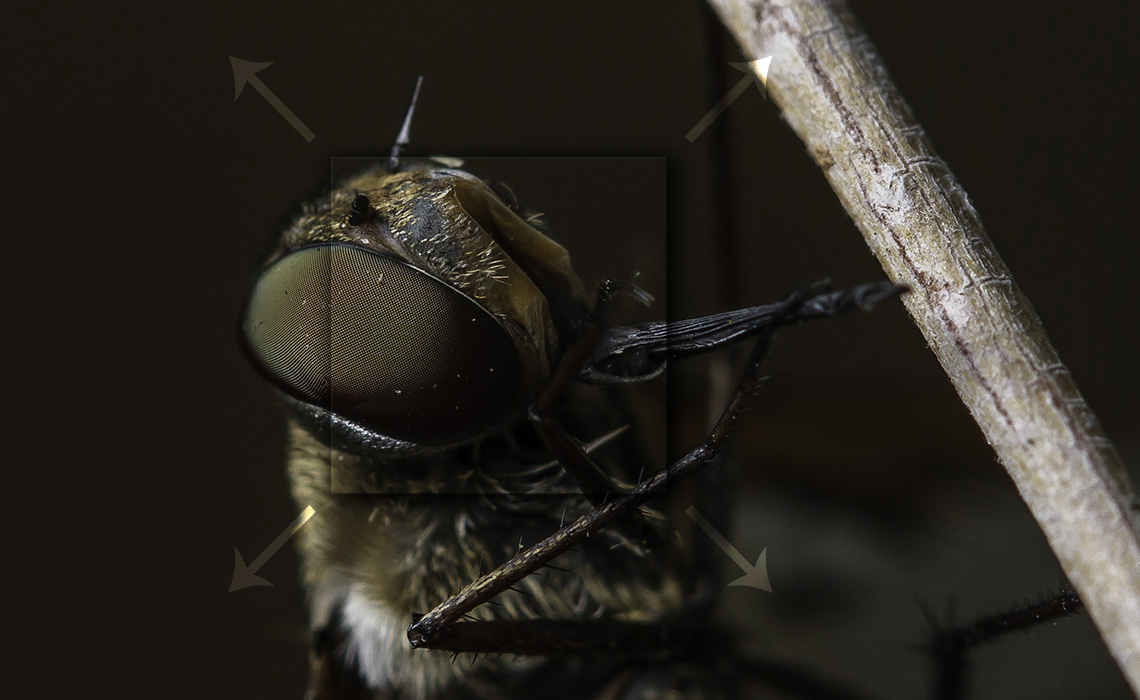
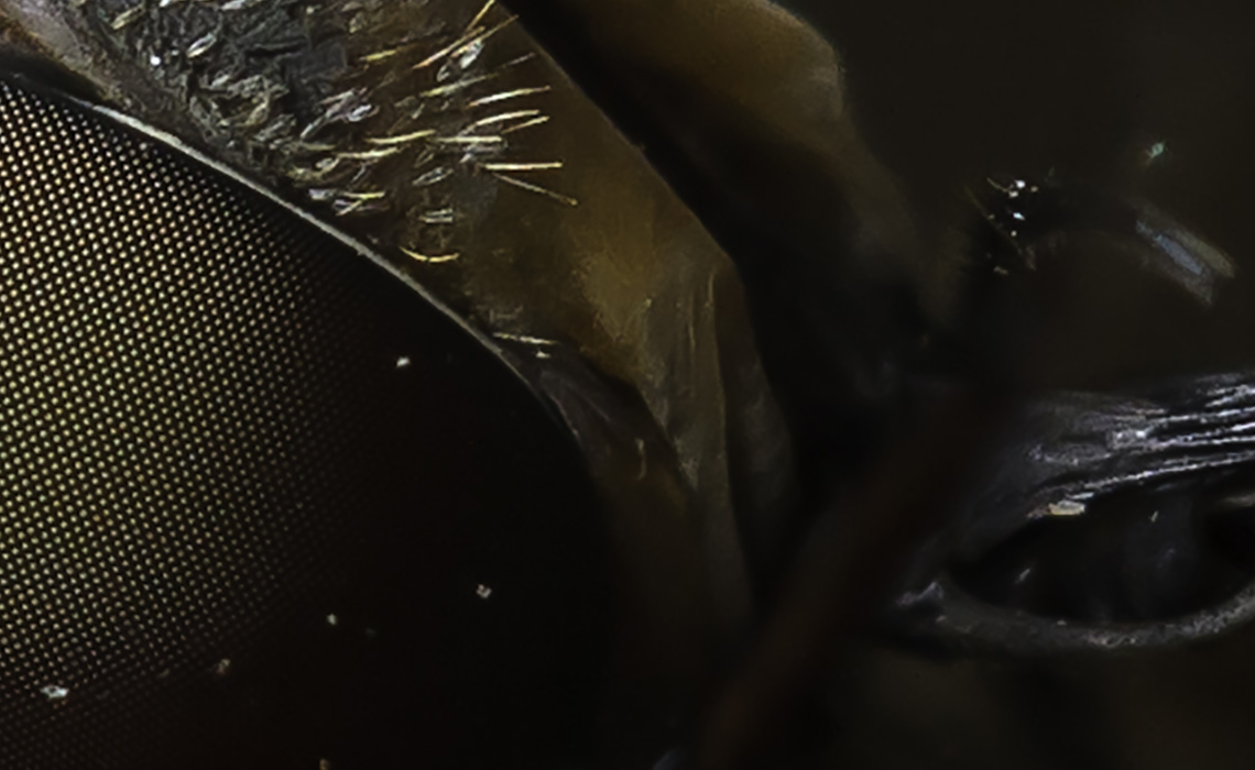
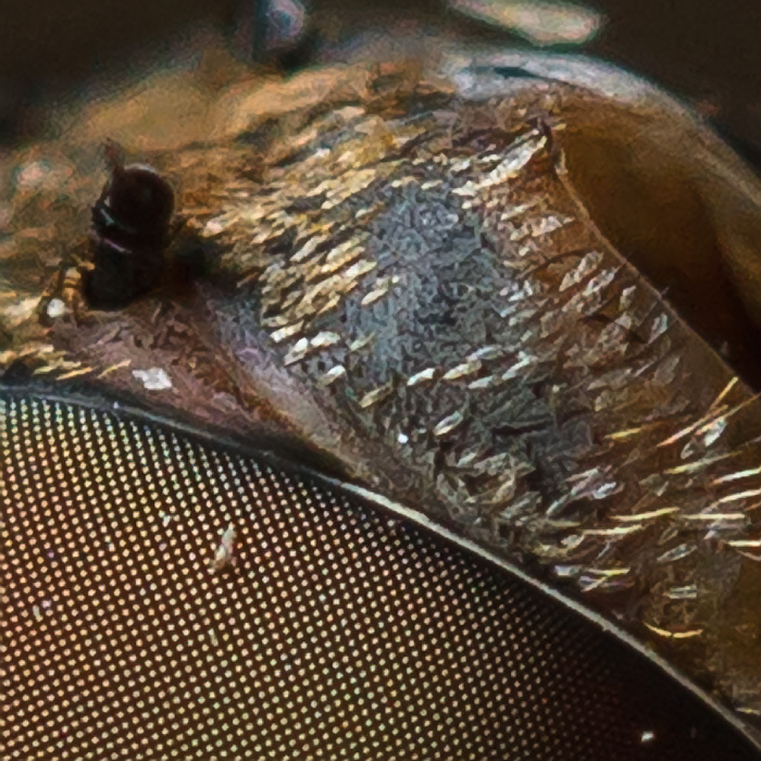
For this particular study, I will be working with a macro photo of a species of fly. The fine details, particularly the eyes, visible in this little bug (as repulsive as it may be), make it an exceptionally good subject for exploring upscaling and sharpening for print. One should always consider the amount of inherent detail when deciding how to upscale an image for print. Many photos simply do not have the level of detail that would warrant such painstaking techniques, however as you can see here in this 100% crop, there is more than enough interesting fine detail that one would want to preserve, even when enlarging 300% or more:

A 100% crop of our subjects head.
In my article about quality inkjet printing, the acuity of the human eye, and the average viewing distances, it was noted that as the viewing distance increases, the print resolution can be reduced without any noticeable loss of detail. While this is true, it makes the assumption that a viewer of a large print will indeed observe it at the expected distance. In practice, however, the assumed viewing distance is not guaranteed, and many a viewer steps in for a closer look, often expecting to see more detail. Achieving the maximum detail in a large print can be important in producing a print that will, quite literally, draw your viewers in.
Sharpness
When viewing a photograph, the detail of a photograph is often lost due to the way it was processed or obscured by imperfections in the way it is filtered and rendered. One of the key aspects of detail is sharpness. Ideal sharpness is perceived when acutance (the definition of edges between areas of perceptible contrast) and resolution (the distinction between closely spaced fine details) are high. The various kinds of processing applied to a digital photograph, from passing through an anti-alias filter by in-camera processing, to scaling an image up in Photoshop, can all affect the sharpness of an image. A variety of methods exist to improve the sharpness of an image, and at lower resolutions, they can be quite effective. The real challenge arises when you need to maintain the maximum level of detail in an image during extreme enlargements.
Data in the detail
When scaling of an image up by any significant degree, say more than double its native size, you often suffer from information anemia and information fabrication defects. The more resolution your native image has, the more leeway you have, however enlargements beyond 2x will usually introduce some degree of softening, loss of detail and artifacting. Image enlargements are usually achieved increasing the resolution of an image up and applying some kind of scaling filtration, such as nearest neighbor (which produces blocky, pixelated images) or bicubic (which smooths out the differences between enlarged pixels.) Image detail is usually preserved by applying some kind of sharpening filter, such as an unsharp mask, which attempt to artificially improve the acutance of an image by hardening the edges softened by bicubic (or possibly more advanced scaling filtration.)
The Test
Both scaling filtration and sharpening try to “preserve” detail by fabricating information. Only an original image at its native size will contain “real” information, and any enlargement will contain a combination of real and fabricated information. Doubling the size of an image effectively doubles the number of pixels, however data stored in those extra pixels can only be generated and approximated from the original image. Bicubic filtration “fills in” extra pixels by fabricating information from nearby original pixels.
Sharpening simulates high acutance by lightening lighter content and darkening darker content along edges. Both processes are limited and imperfect mathematical algorithms that can introduce various kinds of undesirable artifacts into an image when they encounter something that falls outside of the domain of the algorithm. In this test, I’ll be comparing various common forms of image upscaling techniques. The most common form of image enlargement is the Bicubic upscale, which is often followed by an Unsharp Mask sharpening filter.
A variety of third-party scaling tools exist these days, such as Perfect Resize, PhotoZoom, etc. These tools employ more advanced algorithms including fractal and S-Spline scaling, in combination with unsharp masking, to produce some impressive upscaling results when compared to Bicubic. Despite their high tech nature, a very simple trick can be employed to produce the best results without any need for fancy algorithms or special sharpening post-scale: iterative bicubic scaling.
The sample images used below were scaled up from an original center crop of an 18mp image from a Canon EOS 7D of size 5184×2848 pixels. At 300ppi, the original full size uncropped image could generate a 17″x11″ print without any scaling (which is a nearly-ideal size to print with an adequate 1″ border on 13×19″ A3+ paper.) The test will scale the original image enough that it could print a borderless 36″x24″ print at 300ppi. This is an upscale of 2x over the original size or 200% scaling, which is enough to demonstrate the differences in scaling and sharpening techniques.
NOTE: Extreme upscaling starts at around a 200% increase in size, but does not necessarily stop there. Landscape photography in particular, especially from professional landscape photographers, as well as macro photography of both flora and insects, are also often targets for extreme upscaling, by as much as 300-400% (prints as large as 60″ on the long side.)
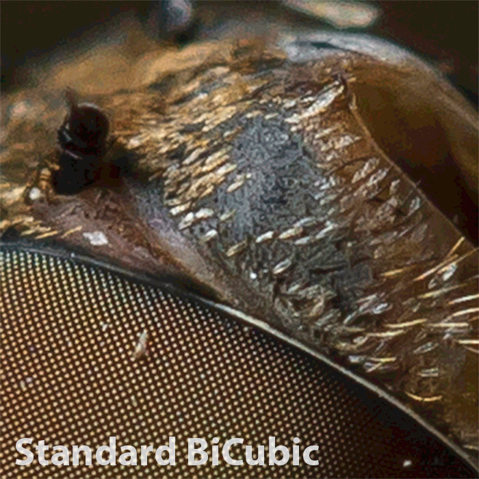
Bicubic Scaling
The obvious starting point for our test is bicubic scaling. This is the Photoshop default and de-facto standard way most people scale their images in most cases. It can provide good results when the ability to view maximum detail is not a concern, and is generally more than adequate for most upscaling. When there is not a lot of fine detail in an image, standard bicubic is all you will usually need.
To compensate for the softening caused by Bicubic filtering, an unsharp mask is often applied to improve the acutance of fine details. Use of a sharpening filter is often the best approach to improving detail in an upscaled image for 2x or lower enlargements, as well as for downscaling. When performing significant enlargement of greater than 200%, algorithms that sharpen by trying to enhance acutance can often do more damage than good, and haloing can become prevalent when using strong enough filter settings to actually do any good. Alternative methods for upscaling will generally be required for extreme enlargements. The sample below compares standard Bicubic and Bicubic with an Unsharp Mask of 75%, 1.5 radius, and threshold of 3:

In the animated GIF comparison above, you can see that while a decent amount of sharpening can improve your standard Bicubic filtering a lot. It will also sharpen noise, and may create halos and other artifacts like color shimering or moire, especially if your sharpening is too heavy.
S-Spline & Fractal Scaling
Many third-party scaling tools exist that can be used to perform extreme enlargements of digital images. They provide some of the most advanced scaling algorithms available today, and can generally do an excellent job upscaling certain types of images. Many of these algorithms are tuned for certain types of image content, and are not ideal for any kind of image. PhotoZoom’s S-Spline scaling is adept at identifying high contrast edges where acutance enhancement is most beneficial and crisp, smooth definition is important. It is capable of preserving smooth edge detail through considerable enlargements.

Similarly, Perfect Resize (once called Genuine Fractal’s) fractal scaling is also adept at maintaining geometric structure through the use of fractal compression and interpolation. No single algorithm is ideal, however. S-spline scaling has the tendency to pass over finer details in its quest to perform ideal geometric enlargement, and can often flatten areas of lower-contrast detail. Perfect Resize has similar problems with detail, however given that it is based on a fractal algorithm, is better at preserving some fine detail at the cost of not being quite as adept at geometric perfection as S-spline scaling is. These tools can be superb when used with the proper kinds of images, such as architecture or images that intrinsically have minimal low-contrast detail and/or many important geometric content.
Iterative Bicubic Scaling
Neither bicubic filtering, nor alternative filtering algorithms such as Lanczos, S-spline, Fractal, etc. are capable of preserving maximum detail to any size. The greater the difference between the original size and the destination size, the more information must be fabricated to “fill in the holes”, so to say. A simple logical conclusion to this problem, when one takes the time to ponder it, is to reduce the difference. Scale an image from its native size to your desired destination size in discreet steps, or iterations, that are a fraction of the difference between the native and destination.
To take our sample image as an example, scaling from 17″x11″ to 36″x24″. Performing a direct Bicubic upscale would increase the image size by 209% in both dimensions. Content would need to be generated to fill in 59,844,096 pixels out of 77,760,000 pixels from the 17,915,904 pixels worth of original image data. That is over 84% of the upscaled images total area, a hefty cost and a considerable drain on image detail. The vast majority of the image would be purely fabricated content. Alternatively, the image could be scaled up in stages, say 10% at a time. The benefit of such an approach is that, for each step, you generate a small amount of new content from a bulk of existing content. Each subsequent step only needs to generate 17.35% of the new image, rather than 84%, and each step has much more accurate information to work with when generating content.
It used to be that iterative bicubic scaling had to be done manually, literally increasing the width and height of the image by 10% at a time in several stages until you just surpassed your target, then downscaling back to your exact target. (Iterative bicubic usually resulted in overshooting a bit, hence the single final downscaling.) Today, Adobe Photoshop CC offers a special scaling option in their Resize feature, called Preserve Details. Using the Preserve Details, you get iterative bicubic scaling automatically, and Photoshop works out the iterations for you. It also has a denoising option which helps reduce noise in smooth regions without sacrificing detail in high detail areas. Here is an example of using Photoshop’s Preserve Details scaling method with 35% NR in comparison with standard Bicubic and Bicubic w/ sharpening:
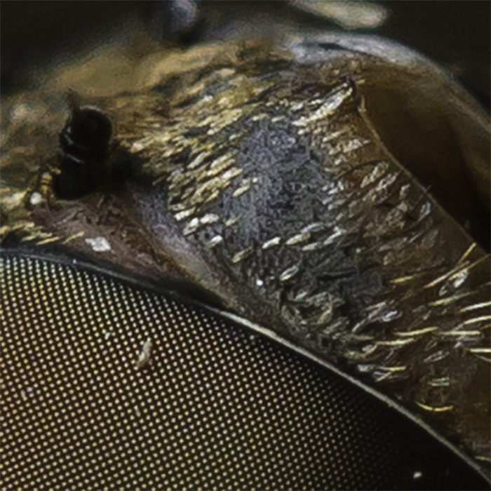
Comparing the above sample to the original direct Bicubic example, and there is a noticeable difference in sharpness of fine details. Most notable are the cells in the eye and the hairs towards the middle right side. This scaling is comparable to the second Bicubic example with the ample Unsharp masking applied, and in fact better preserves certain details that the Unsharp mask did not. It is also comparable to the S-Spline & Fractal scaling, as can be seen in the comparison below:
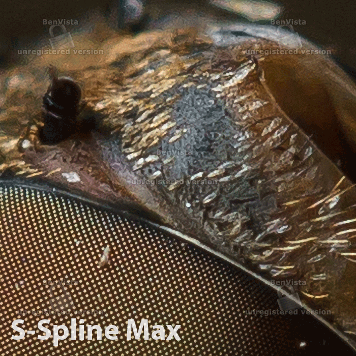
Note that while both S-Spline and Fractal have sharper edges and in many senses “crisper” detail, that detail in comparison to iterative bicubic scaling is often rather flat. The soft gradients and edges that is important to some detail, like the cells of a compound eye, are lost due to the way information is processed by S-Spline and Fractal scaling. Instead of preserving original data, it is replaced with regenerated content, hence the sometimes flat look to certain fine details.
Note: some posterization has occurred in smoother regions due to saving the image as a .gif…posterization is not normally inherent in Bicubic scaling, although it may present in Fractal and S-Spline scaling.
Final Conclusion
While it has long been held that film has a considerable edge over digital when printing significant enlargements, I believe that is an old misnomer that can be empirically tested and put to rest today. As with digital enlargements, film enlargements are still ultimately fabricating information when scaled beyond their original size, simply via a different mechanism. With film it is often easier to bring out fine details (and fine imperfections) that exist and make them more prevalent in an enlarged image, however on a size-comparable basis, film doesn’t ultimately contain significantly *more* original information than digital.
One caveat here, shooting with a larger film format will obviously captures more original data, however significantly enlarging a 4×5 slide to 55×36 is not all that significantly better than enlarging an 18-22mp digital photograph to 55×36 when using advanced scaling techniques. On the flip side, with digital, you may actually have more options at your disposal for preserving detail, or controlling how intermediate detail is fabricated during significant enlargement than you do with film, and careful massaging of your original pixel data can produce some incredible results.
As a side note, huge enlargements of film, either smaller formats or large format, are usually done by scanning the film first, and digitally scaling up anyway.
While performing this test, a single enlargement of the original image was made by scaling it to 55″x36″. The image was a whopping 16500×11003 pixels in size, or a monstrous 181 megapixels, some 318% larger than the original image! The image was compared to a direct Bicubic version as well as a Bicubic with Unsharp masking. The iterative scaling preserved at least as much detail as the sharpened version, without the tonal flattening of low contrast detail or harsh edging to fine details. Examples of all three versions below (direct bicubic, bicubic w/ sharpening, staged 5% scaling):
A 55″ enlargement is a huge size, and maximum detail can easily be preserved in a digital image for printing at such sizes. Prints of 50-55″ are fairly popular amongst experienced landscape photographers, and a landscape photograph looks truly superb when framed and wall mounted at such sizes. So for all you digital photographers out there who have heard for years that you can’t get a high-quality super-enlargement with digital, here’s to proving the nay-sayers wrong.

[…] Jon Rista Nature Photography […]
The lighting and detail on the insect are gorgeous, absolutely. I will be revisiting the article to absorb the scaling information. I remember when I bought my first printer the Epson 2200, I agonized over color space, scaling and sharpness and what the screen image would look like in print..how big a print I could do from the full file or a crop etc. Later I bought the Epson 4880 printer and by then was a lot more relaxed about it all..feeling that if the print came out well, then I would be satisfied and not worry about the monitor vs paper etc. What I did find, at least for my purposes, that the print was more forgiving than I had expected. Since I like to scroll around and examine pixel smoothness or digital noise, I always want to reject if I see unattractive sharp edges. But, most of the time those things have nothing to do with print appearance…at least not at my format levels. Not doing billboards or anything 🙂 Someone told me early on that if I wanted to make prints, shoot in Adobe 1998, if web shoot in sRGB,most camera’s default. So I have always shot in Adobe 1998 even though I probably have more sRGB web display, and more converted to sRGB by prints labs that the straight Adobe prints. I had to relax about it all.
What printer are you using? If you said, I apologize for asking. So many options now.
Thanks! The insect came out beautifully. I think he was on his last legs…he was pretty sluggish, and therefor a rather cooporative subject.
As for prints, if you print at the cameras native size or lower, none of this scaling stuff matters. In the case of my Canon 7D, it is effectively ready to go for native 13″x19″ prints, and anything smaller, like 11×14 or 8×10 is a no brainer. Scaling well only really matters when you intend to print large, or huge. Personally, I like my prints huge. I print most of my stuff at 24×36″ or larger, often on very high quality coated inkjet canvas via a lab local to Colorado. I have a few prints at 40×30″ hanging in my house, and I have a couple area of my wall slated for 60×40″ prints (when I can afford to print them.) It is when you get to those scales that this kind of scaling technique is necessary. Ironically, at 60×40″, the print resolution is usually only 200ppi, but you can maintain better quality and better tonal grading if you manually scale the image to the exact print dimensions yourself, rather than letting a printer driver do it for you (which will almost always result in artifacts and/or posterization unless you or your lab are using a high quality custom rasterizer.) I’m a firstborn, and therefor a born perfectionist…so little minutia like extracting the maximum amount of detail even in a 60c40″ print are the sorts of things that matter to me. 😉
Regarding gamut, I always shoot Adobe RGB. It used to be that printers could only print around sRGB gamut, but these days with Epson and Canon printers that use high quality pigment based inks, they achieve at least Adobe RGB gamut, and in some ways, extend beyond it (although usually black point in print is much lighter than black point on screen, and white point is duller.) The old addage of using sRGB for print not longer really applies, Adobe RGB is generally a better bet these days. For web, sRGB is still the standard, however browsers have been starting to support proper ICM (Image Color Management) these days, so in the long run, it shouldn’t matter if you use sRGB or Adobe RGB or even Pro Photo RGB, in a couple years browsers should always render them properly.
I personally use a Canon PIXMA Pro9500 Mark II for my prints. I’ve had the printer for about four or five years, and it is a good workhorse that can print up to 13×19″. I am looking to get a larger format printer, something that can do at least 24″ prints, maybe larger, to support my printing needs once I get my photography storefront up and running. I like to print, and I love large prints, and I’d prefer to do it myself rather than farm it out to a lab (which would really be impractical from a business perspective…labs charge more than the base cost would be for me if I printed alone, and almost as much as I would have to charge my customers, meaning I really couldn’t make any money if I sold my prints by farming out to a lab.) I am not sure which brand I’ll buy…Epson or Canon. Both offer EXCELLENT pigment based printers, however I’ve never really liked Epsons’ approach of sharing a single black ink head between two different types of black ink. It tends to be very wasteful, since you have to flush the head when switching. Canon uses separate ink heads for each black ink type, so no waste.
I am also very familiar with Canon printers, so it would be easy to start working with one of their imagePrograf commercial-grade printers (i.e. ipF6300 or something along those lines.) Epson currently has the ink advantage though, with their UltraChrome + White pigment inks, they get a better gamut…assuming you are willing to shell out the $7000 or so for one of the top end commercial printers that use those inks. (Personally, I think a $3000 ipF6300 is far more economical for me, and assuming my photography business takes off, is something I could justify the cost of, amortize over five years, and actually make some money with.)
Its Adobe RGB for prints, sRGB for web as explained to me. I agree on the Epson share Matt and Photo Black print head. I understand there are models now that have the separate carts, so if you consider Epson check that out. Personally, I love Epson but Canon is also excellent and I have friends using Canon for awesome prints. I didn’t mean to indicate I am not a stickler for detail (firstborn too!!), but I did have to relax a bit…well people were sick of hearing me whine about color space, resolution etc when they couldn’t see what was the matter.
I am certain that your large prints are just to die for with that amazing quality you achieve in your shots, which as great as they are on the web, I know are even better in print!! Maybe you could take some pictures of your wall gallery and post them. I think it would be lovely to see your work in a nice display setting!!
Thanks for all you share as these practical details are invaluable when trying to max what you do. And, even though I’ve agonized over some time, I still need to be reminded to study and consider..technology keeps morphing anyhow and you have to keep up.
Oh, I do have a local printer who does print Adobe RGB (Adobe 1998 as I call it) and it does make all the difference. Many places still default to sRGB though, and all in all that is not always a bad thing like I thought in the beginning.
Thanks again..sorry for the ramble!!
No apologies necessary! Sounds like you are a print geek just like me! 😀 I personally love this stuff…photography, color, printing…PAPERS! I love finding new paper types. I must have found eight or nine brands and dozens of papers, many of which are just to die for. Hahnemuhle, Moab, Red River, Ilford, Harman, Canson, etc.
You are right, sRGB is primarily for web these days. Which is really kind of a bummer, as it is such a limited gamut (it doesn’t support the kind of rich saturation that Adobe RGB (or Adobe 1998, same thing! :D) supports. It used to be that no browsers at all supported ICM, but there are several these days that do now, and hopefully that will become a standard thing on all devices within a few more years.
For most of my prints, I don’t really agonize all that much. I simply scale the image to the right PPI and dimensions, maybe apply some unsharp masking, and print. But, that is largely because I can only print up to 13×19″ (A3+), and my camera supports that resolution natively. The only time I really put a lot of effort into it is when I print huge, 36×24″ or larger. Even then, it is probably a bit obsessive, as most of the time I print on canvas…which due to the texture makes it difficult to see fine detail anyway. But, perfectionist. 😉
I am glad you like the technical articles. I have so many that I want to write. These two recent Knowledge Center articles on printing and scaling were actually based on two things I wrote years ago on photo.stackexchange.com. I wanted to update them a bit, and bring them onto my blog. I have tons of other tidbits of useful knowledge though…about noise, how to clean it up, about how cameras and optics work at a theoretical level (little details that you don’t need to really think about, but which knowing can really help you improve your photography), etc.
I have more time on my hands now that I’m freelancing…long time between jobs…so hopefully I’ll be able to get more of the junk in my head into junk on a page. 🙂
Oh the papers for sure!! I think Red River does a great job and my early cards were printed on their Polar Matt paper. My personal favourite, of those I’ve tried, is Epsons Velvet Fine Art Paper, and I like their Exihibition paper too. I like that latter because I get texture and don’t have to switch to the matt black.
I haven’t had much chance to use Epson papers. They are probably one of the few brands I have no real experience with. I know Epson makes great printers and papers, though, which is why I’ve been seriously considering moving to them for a larger format printer. Really depends on whether I can find one without that black ink flushing issue, though, because I print on both glossy and matte papers regularly.
I like Red River Papers as well. I’ve used their metallic paper, Polar Pearl Metallic, which is pretty nice. I actually was comparing Polar Pearl Metallic with Moab’s SlickRock metallic paper. Overall, the two are very similar, with slightly different pearlescence. The one key difference seemed to be that the Moab metallic was smoother…RR seemed to have a problem with random grit…almost every sheet had one or two little pieces of 1/2mm grains of sand or something embedded in the paper coating. Not really a huge deal, but they were noticeable. I am currently using Red River’s Aurora Fine Art papers, both natural toned and white. I like the look of the natural toned better, but it’s been interesting printing on the white…colors lose that warm feel, but they are still extremely nice prints.
If you haven’t tried any yet, you should check out Moab papers. There are a number of really good ones. The metallic is good, as is their Entrada rag (very nice). They have a number of other textured papers as well, and if you like textured papers, theirs are some of the best. They have a very nice canvas, one I would prefer to use for all my canvas prints, but it’s fairly expensive, and I don’t have a printer large enough to print 60×40″…so. ;P While I am not usually a fan of papers with OBAs, Moab has one that has some of the best dynamic range I’ve ever seen in a paper…Lasal. Their Lasal Photo Matte paper is ultra bright, and preserves the most exquisite detail in the deep shadows. Wonderful paper.
If you are a REAL born and bred, died in the wool, true to heart *PAPER SNOB*, you could get their Moenkopi Washi Bizan 300 (http://moabpaper.com/moenkopi-bizan-300/). It is a 300gsm paper, hand made, for $37 per sheet! It’s an ultra thick paper, entirely natural fiber, and apparently has a truly luscious texture. I’ve wanted to give one sheet a try, but I have not yet made a photo that I think is worth of such a paper. 😉
that is an awesome photo!
Thanks! Taken handheld with none other than the lowly EF 100mm f/2.8 Macro lens, under natural sunlight, if you can believe that. 😉