Astrophotography Basics: Signal, Noise and Histograms

As astrophotographers, we must be deeply versed not only in image acquisition, but also in image processing. The effort required to process an astrophoto is much more involved than that required for the average daytime photograph. There is an extensive amount of work involved to produce world class images, including both pre-processing (calibration, registration, integration) as well as post-processing. A bit of theory around signals, noise and histograms helps both with the acquisition process as well as with processing.
Signals & Noise
Every image we process is a signal. A digital signal, to be exact…and a two dimensional one. Every pixel can be thought of as a one dimensional signal. Even a single pixel has noise, although it may seem counter-intuitive to think of it that way. Noise is the deviation from the proper, correct or “normal” value that a pixel should have for the given exposure. The grainy noise we usually think about when viewing an image, a two dimensional signal, is the result of random deviations from the norm for each pixel. The more noise we have, the larger the deviations tend to be, and the grainier the image appears. Noise can be, and usually is, a bit more complex than that…as it doesn’t necessarily only occur at the pixel level, however for the purposes of this article, per-pixel noise is generally what we are concerned with.
The amount of apparent noise in an image depends on the signal to noise ratio. The stronger the signal, the less apparent noise we’ll see. At a mathematical level, noise may be statistically higher in an image that appears less noisy…it depends on how strong the signal is relative the noise in each image (the SNR). When it comes to image processing, statistical noise, standard deviations, and signal offsets ultimately matter more than what we might see, as if we understand the statistical nature of noise, we can observe how the SNR changes as we change exposure, integrate more information or apply noise reduction routines.
Histograms
One of the astrophotographers best friends is the histogram. At the most basic level, a histogram is a plot of the distribution of tones in an image, from black through all gray tones to white. A savvy individual, however, will be able to glean much more from a histogram than simply tonal distribution. Within an astrophotography context, a histogram also tells us the exposure level, noise levels, noise characteristic (Gaussian…or not; indications of patterns like banding; etc.), color channel offsets, dynamic range usage, color balance and image contrast. The histogram is our primary gauge of the nature of an exposure or an integration, and is one of the most fundamental tools we use to evaluate our data. A histogram is also another way of representing an image signal. Instead of being spatial and having three dimensions like the spatial representation of an image: width, height, and intensity; instead a histogram is two dimensional, having only the attributes of intensity and volume.
Before we delve into reading details about noise and exposure and such from a histogram, it’s best to understand the basics. A standard histogram is a “compressed” representation of all the tones in an image in a space that cannot actually represent every single tone individually. A 16-bit TIFF image can contain up to 2^16 or 65536 different tones. The width of the average histogram is 256 pixels, and the width of the example histograms above is 522 pixels. Every column of pixels represents a different tone…or as is actually the case, because 522 (or 256) is a significantly smaller number than 65536, a small range of tones. In the histograms below, every column of pixels represents a range of 125-126 tones. With a more standard histogram, every column would represent a range of 256 tones. In the case of a 14-bit image, every column in the histograms below would represent 31-32 tones, or for a more standard histogram, 64 tones. In the case of a 12-bit image, it would be 7-8 tones and 16 tones, respectively. With astrophotography, we generally work with 16-bit data at the very least, and in the case of more advanced processing tools, possibly with 32-bit or 64-bit floating point data (although when it comes to histograms, that data is first converted to a discrete format for rendering in the histogram…usually 16-bits.)
It is important to keep this approximation of tonal distribution in mind. It’s accurate enough for most things, however it is not 100% perfectly accurate. In the case of PixInsight, the histogram can be zoomed into, and if you zoom in enough, every distinct tone in the image, for each color channel if so desired, can be examined:
Anatomy of a Histogram
The distribution of tones in a histogram ranges from black at the left edge, white at the right edge, and the grade of tones of increasing intensity from left to right between those two extremes in the middle. In the case of a color histogram, the pure form of each color at maximum intensity is at the right edge. For the sake of clarity, we will call the left edge natural black, and the right edge natural white, as once we get into modifying image data, the final black and white point of the data can (and usually does) change. We will call those points the black point and white point, along with the grey point, the three primary adjustments that can be made with some histogram tools. In the context of astrophotography, the signal will peak at a certain point, for each channel. This is the background sky peak or “hump” as it is sometimes called. It may also be called the skyfog peak, as outside of an truly exceptional dark site, the background sky will usually appear to have a haze or fog in it from light pollution.
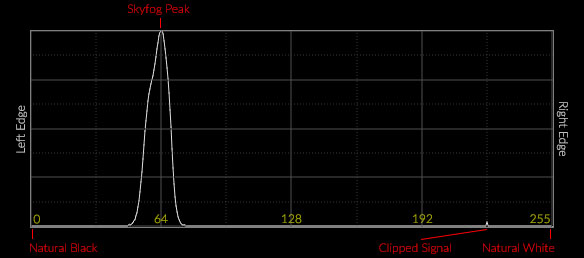
You may also notice other peaks in a histogram for astrophotography sub exposures or integrations. The most common alternative peak is the clipping peak, most often observed with DSLR data, where the signal started to clip and peaked where the camera white point was set. Sometimes this will be at the right edge of the histogram (i.e. with an ISO 100 exposure)…sometimes it will be somewhere in the middle of the histogram (especially with a dynamic histogram like PixInsights). You may also notice a peak near the left edge. This is indicative of clipped or “blocked” blacks, and usually only occurs when an image has been stretched and processed.
Histograms are most frequently rendered with 8-bit data, so the scale ranges from 0 at the left edge, where natural black is, to 255 at the right edge, where natural white is. More advanced histograms may render data with a higher bit depth, including 14-bit (0 through 16383) or 16-bit (0 through 65534). I’ve specified the primary divisions of the histogram above with 8-bit values, simple due to space constraints, any range of numbers for any given bit depth still applies.
Example Histogram
A typical astrophotography histogram for a single sub loaded and rendered linearly will usually appear to be less exposed than it may have appeared either in a back of camera preview histogram, or in most standard image processors. This is because most image and RAW processors will apply non-linear tone curves to apply a standard look and feel, a standard contrast, to most images. Depending on the image processing program you are using (such as PixInsight, my tool of choice), the data may be loaded into a large numeric space, and loaded without any standard RAW editor clipping to account for ISO’s above base, so the tonal distribution may look shortened and rather left-shifted as well.
A typical “1/4-1/3rd histogram” sub exposure acquired with a Canon DSLR at ISO 1600, using a light pollution filter, rendered linearly without demosaicing (effectively true, unprocessed RAW), might look like this:

Looks a little strange, and probably nothing like what you may have seen on the back of your camera histogram. If we apply a curve that approximates what most RAW processing programs do with the data, and adjusting the white and black points to account for the ISO setting used, the histogram looks like this:
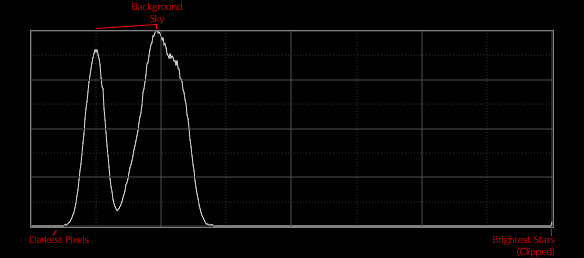
This probably looks a lot more like what you may have seen on the back of your camera, or perhaps in an image acquisition program like BackyardEOS/Nikon, APT, Nebulosity, etc. This still isn’t an entirely accurate reproduction, as it is still working with original non-demosaiced pixel information. If we demosaic, we finally get a histogram that more closely reflects a back of camera or RAW editor histogram, and the different distributions of exposure for each of the color channels is revealed, explaining the double humped nature of the histogram plot:
The Histogram Cornucopia
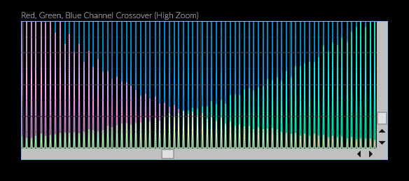
More information can be gleaned from a histogram than just where the skyfog peak(s) are, and whether the signal clipped. First the skyfog peak itself begs a deeper explanation. That is your exposure depth. The “deeper” your exposure, the more shifted to the right your histogram peak (or peaks, in the case of RGB) will be. When it comes to color channels, the offsets of each peak are an indication of the inconsistent response of the pixels of each color channel to light, which may simply be an intrinsic factor of the CFA used on a bayer sensor, the use of an IR/UV cutoff filter (which are also usually used in DSLRs, and the removal of the IR cutoff filter is often one of the primary forms of astro modification of a DSLR, which can lead to more right-shifted red channels in histograms with modded DSLRs.) Offsets in color channels may also be due to the use of filters, such as the light pollution filter used while acquiring the image used for the example histogram above. The animation below simulates the Back of Camera (BoC) histograms for various exposure levels.

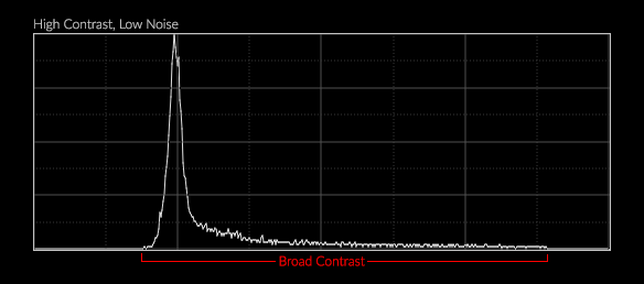
Another image trait you can find described within a histogram is image contrast. Contrast has to do with how the tones of an image are distributed. An image with low contrast will usually have a narrow distribution of tones while an image with high contrast will have a wider distribution of tones. In the case of astrophotography, our initial linear images are usually fairly low in contrast (exceptions being narrow band images, which can actually be very high in contrast, as that is one of the primary reasons you use such filters in the first place), and will end up with higher contrast as the result of processing, primarily as the result of stretching the linear data into a non-linear state.

Another thing that can be read from the distribution of tones in an image is the amount of noise. In the contrast example above, you’ll notice how the background noise increased along with the increase in overall contrast. The width of the peak also increased. It should be clearly noted that the width of the peak is not necessarily indicative of contrast, however it usually is indicative of the amount of noise in the image. The same high contrast image after a considerable amount of noise reduction applied maintains it’s contrast, but has a much narrower peak:
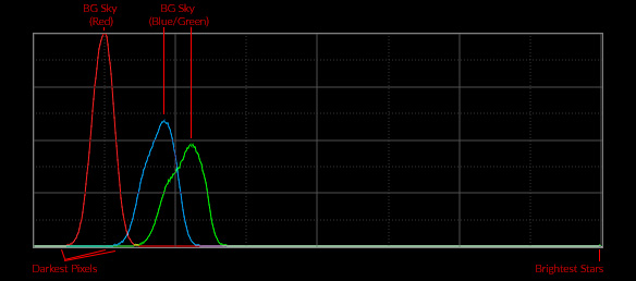
When it comes to RGB histograms, one of the additional bits of information you can glean from the histogram is the fit and balance of your color. From the example RGB histogram above, even a histogram-reading novice should be able to tell that the image would be a bit of a greenish-blue color, rather than balanced color. This is due to the lagging position of the red channel peak, and the leading positions of the blue and green channels. The balance is more green shifted because of the lead the green channel has over the blue channel. If the red channel were shifted up to straddle the positions of the blue and green channels, the seemingly logical yet naive conclusion would be that should improve the image’s color balance. It’s not quite as simple as that…as the “fit” of the data must match as well. The red channel peak is much higher than the green and blue channels, which sit around 50% height. That indicates that once the channels were aligned, there would actually be more red than blue or green within the region of overlap, and color balance still would not be ideal (it would end up brownish, due to the fact that the green channel still has some brighter tones). To achieve ideal color balance, with a neutral baseline, one must “fit” the color channels to each other, which normalizes the position and distribution of tones within each channel to match each other as best as possible. The alignment and normalized distribution of tones is ultimately what balances color. The difference between simple channel alignment and total channel fitting is demonstrated in the animation below:

There is one other thing that can be read from a histogram that is useful for astrophotographers: clipping. When parts of the image data begin to clip, it means we are losing information. Clipping is something we generally try to avoid, although in some cases for aesthetic purposes, we may wish to clip some information some of the time. Regardless, it helps to understand what that looks like in a histogram. The histograms below demonstrate both black point clipping or “blocking”, as well as white point clipping:

Clipping is an inevitability with noisy images, and is one of the key reasons why we apply noise reduction. With reduced noise, you often gain headroom and usually gain footroom, allowing you more control over the final distribution of tones in your image without clipping.
Anatomy of Signals in Histograms
Now that you understand how to read a histogram, it’s time to delve deeper into the nature of an image signal as represented by a histogram. The above traits of an image are all spatial and visual traits…the contrast of the “image” at large, the color balance of the “image” as a whole, etc. As an astrophotographer processing an image, you will often be less concerned about the “image” and more concerned about the “signal” and the noise within that signal. The general anatomy of an image signal as represented by a histogram is as follows:
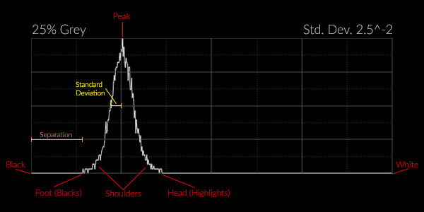
As before, the signal in an astrophoto is generally represented by one primary peak. This peak is centered around the mean of the signal. The entire signal is generally contained within some range of tones, from the “foot” to the “head.” The foot of the signal represents the darkest tones in the image, the “blacks”…although they may not actually be black depending on the exposure level and amount of noise. The head of the signal represents the brightest tones in the image, the “whites”…although again they may not actually be white, depending on the exposure level and the amount of noise. The signal has “separation” from the left edge of the histogram, the distance from the left edge to the foot. The signal also has a standard deviation, which is generally the separation between the center point of the signal peak and the edge of the signal peak where the area underneath the signal curve represents 34.1% of the total area for that side of the signal.
Noise and Standard Deviation
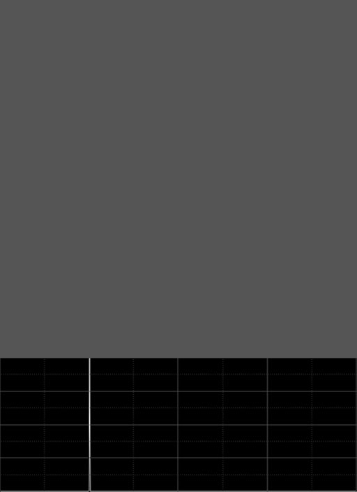
The histogram above was generated from a 512×512 pixel 25% gray image that had Gaussian noise with a standard deviation of 0.0025 added with PixInsight’s NoiseGenerator tool. For the sake of simplicity, this simple image is going to be used to describe the nature of a signal and the nature of noise in terms of a histogram. The first thing to cover about signals is that, barring any noise, the standard deviation of most astro image signals will be very, very small. The 25% gray image without any noise at all is really just a vertical line, as every single pixel in the image has exactly the same tone or intensity level:
This image has a standard deviation of zero. Watch what happens as increasing levels of noise, with standard deviations of 0.0125, to 0.025, to 0.05, are added to the original image:

The histogram peak widens due to the fact that the amount of variation in the intensity level of the pixels increases. Because the noise follows a Gaussian distribution, the histogram takes on a bell curve shape. The more noise, the wider the histogram peak. Why? Because with increased noise comes an increased range of possible intensity levels. Gaussian is not the only possible distribution that noise can take. For example uniform noise has an even and consistent “uniform” distribution around the mean:

Astrophotography images are produced by the random distribution of incident photons striking each pixel of a sensor. Such a random distribution of discrete events is called a Poisson distribution, which as you can see from the example below, closely approximates the Gaussian distributions of the examples above:
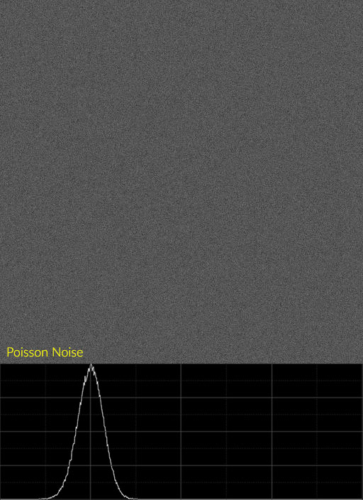
The image above was produced by applying the NoiseGenerator tool in PixInsight with the Poisson setting at 1.0 amplitude to a black image, ten times in succession, then stretched such that the histogram peaked at 25%. Over time a Poisson distribution of random photons striking pixels will produce a pattern of noise in the image that very closely approximates a Gaussian distribution, such that the margin of error is small enough to ignore. Therefor we generally assume that images exhibit Gaussian “behavior” for the purposes of most forms of noise reduction.
Noise in the Histogram
Something else to note with these example images and histograms is the nature of the histogram plot or curve itself. The curve itself exhibits noise, it is not a very clean, smooth line like a Bézier curve, it’s jittery, has small ups and downs as you progress through the range of intensity. This is not exactly indicative of the noise in the image itself…that is really indicated by the width of the peak, the standard deviation. The noisiness of the curve itself is indicative of noise within the noise…the deviation of pixel intensity from the median is itself experiencing noise. Instead of a “perfect” bell curve that would be indicative of a “perfect” distribution of tones around the mean, you have a noisy bell curve. This may seem like a strange concept, but understanding these traits of the histogram are actually quite useful for identifying the various types of noise you have in your image.
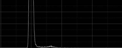
Non-gaussian forms of noise will affect the histogram in specific ways, however. Another common form of noise in astrophotography is hot pixels, a consequence of dark current. Hot pixels tend to take on a form similar to “impulsational” noise. Impulse noise is a form of noise usually added by EM interference, and there are times when such interference may be introduced into your sensor signals by outside sources (i.e. a dew heater cable twined with your camera power cable might potentially introduce any number of interference signals). An image with hot pixels does not exactly replicate impulsational noise, as usually the pixels are mostly just hot, with far fewer being cold, however a similar pattern in the histogram forms towards the right of the primary peak.
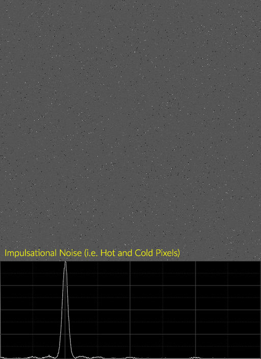
For this example, I generated an image with Poisson noise, then added four rounds of impulsational noise at different intensities to the data to mimick hot pixels. Note the “ripple” effect in the histogram as it trails off away from the primary peak. Here is an example of real hot pixels from a sample of a 5D III 24°C dark frame:
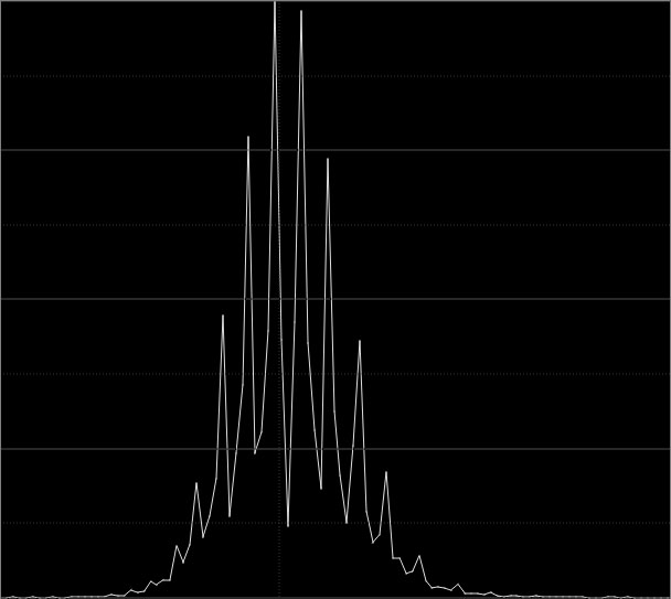
Another thing that you can sometimes identify in the histogram is banding. It really depends on the nature of the banding whether it will show up in the histogram or not, as not all banding is the same. Reducing the bit depth (resolution) of the histogram can help here by eliminating high frequency noise, and in the case of the histogram below, I dropped it to 9-bit. It is possible to identify banding in a higher resolution histogram, however it can be more challenging due to the fact that noise occurs in a range of frequencies that interfere with each other.
Noise and Separation
In the anatomy of a signal diagram above, one of the traits specified is separation. This is an important concept that plays a big role in the image acquisition process. Separation is the shift of the histogram, namely the foot of the histogram, from the left edge. The purpose of sufficiently separating the histogram from the left edge is to ensure that you avoid “blocking up” any of the signal. A signal can block up along the left edge of the histogram when there is high noise, when a large deviation from the expected value results in a strong “negative signal value.” If you have a bias offset of 100e-, and a signal strength of 20e-, but your noise is so high that you have a maximum deviation of 150e-, then any pixels that experience that much of a deviation negative of the expected value will end up black.
There are several reasons why this may happen:
- You used very short exposures.
- You have high light pollution.
- You have high dark current.
With most cameras used for astrophotography these days, read noise is low enough to not be of significant concern. It is usually swamped by object signal at the very least, and there is almost always as much or more signal from airglow and light pollution as well. The only time read noise really becomes a problem is in scenario one, very short exposures…but only when imaging at a very good dark site (darker than 21.8mag/sq”). In all other scenarios, it is light pollution or dark current that might result in your signal blocking up. The higher your noise is, the more separation you need to avoid blocking the signal up. By shifting the exposure farther to the right, you add signal.
Reusing our example from above, if you have a 100e- bias offset, and you expose for longer, instead of a 20e- signal you end up with a 80e- signal. Now even if you have a 150e- negative deviation due to noise, you’ll still have a meaningful, and potentially recoverable, value for that pixel. At the very least…separating sufficiently ensures that when you stack individual sub frames (which is the best way to recover information that might have otherwise been lost to noise), you have REAL information in the noise, and none of it has been disturbed by clipping some pixels in each frame to black (such pixels ultimately need to be discarded, but of enough pixels block up in the blacks due to high noise, rejection will fail to work sufficiently, and the final reconstruction of your image will be flawed.)

In the example comparison above, the median tone is 0.0125, or about 820 in 16-bit, or 205 in 15-bit. This is a pretty low signal level, akin to about a 1/5th histogram exposure. Increasing noise with standard deviations of 0.00125, 0.0025, 0.00375 and 0.005 are added to the median level. You can see in the histogram, which has been kept linear (so what you see here is something you are unlikely to see on the Back of Camera histogram), how the foot of the signal starts to ride up the left edge as the noise increases. In the final example, you can clearly see “pitting” in the image…this is where the signal level has hit zero and groups of black or very nearly black pixels are forming. These pits cannot be properly recovered in any matter…not even by stacking. The only solution is increasing the exposure time, which shifts the signal to the right, thus increasing separation of the noise foot from the left edge of the histogram:

In the example above, signal has been increased by factors of two as standard deviation of noise also increased by a factor of two. This results in an ideal separation, with the signal foot ending just before the left edge of the histogram. This is an idealized example, as it was mathematically generated. During real-world imaging, it is difficult to impossible to get an accurate read on your histograms as your image sequence is running. Most histograms do not allow zooming at all, and those that do are usually not going to render the information at high enough resolution to give you a proper indication of how deeply you should expose. Such is why we have common exposure rules, such as the ubiquitous but rather basic “separate the skyfog peak from the left edge”, which is good advice if a little vague. Another common rule is the 1/3rd histogram rule for DSLR imagers. Neither of these rules is ideal, and it ultimately depends on the kind of camera being used, the type of filters being used, and the amount of dark current or light pollution what amount of separation is sufficient. The 1/3rd rule for DSLRs, which is often stated as the “1/4 to 1/3” or “1/6 to 1/3” rule, is a safe guideline. It ensures that you separate the signal sufficiently for most imaging circumstances, with enough headroom to absorb extra noise if it occurs (i.e. spikes in sensor temperature or light cloud cover passing through, which tends to increase light pollution or reduces signal…in either case, SNR drops.)
Noise Reduction and the Histogram
Before I wrap this article up, one final thing about noise and the histogram. It helps to understand the nature of noise reduction on the signal and noise as represented by the histogram. Remember that increased noise increases the standard deviation of the signal, which increases the signal peak’s width in the histogram. It stands to reason, then, that noise reduction would reduce the standard deviation and narrow the signal peak’s width. The examples below were based on the the bright sample from the previous example, followed by one then two passes of noise reduction that reduced standard deviation by approximately a factor of two each time:

As expected, the standard deviation of the signal narrows as it’s noise is reduced. There are interesting implications for this change in the histogram as a result of noise reduction. The example above has been “stretched”, as at it’s native signal level the image would have appeared black. It’s been stretched such that the signal peaked just a little beyond 1/3rd histogram. Note the nature of the foot of the signal in it’s initial state. You can see noise in the foot almost all the way to the left edge of the histogram. Such a signal level is quite bright…and this kind of smooth tone exemplifies background sky, which shouldn’t be so bright.
However in order to reduce the signal level back to a more reasonable “dark dark gray” that better represents the true background color of the night sky, you run the high risk of clipping blacks. You have some leeway to reduce midtones (which may not be appropriate), and very little leeway to increase the black point. After even one pass of noise reduction, the leeway to adjust the signal by adjusting either the black point or mid point increases significantly. The signal peak could quite easily be reduced to as little as 1/8 histogram and the black point could be shifted up beyond 1/4 histogram in order to produce a more realistic background level. Such is the value of having low noise…it greatly increases your editing latitude, without risk of clipping any part of the signal.
Conclusion
The histogram is a very powerful tool, both for analyzing images, but more importantly for astrophotographers, for analyzing signals and noise. Histograms are able to tell us things both about the images we are working with, such as exposure, contrast and color balance, as well as things about the signals that represent those images, such as standard deviation of noise, signal separation, and even what kinds of noise artifacts we may have in the data. Histograms tells us how much editing leeway we have…or don’t have. They give us an alternative visual indication of the changes to our data resulting from noise reduction or stretching or detail enhancement. I hope this article has given you a deeper understanding of the histogram, and will allow you to use it more effectively in your own astrophotography.
